#9 of 33 Art Projects: Fall Cover of the Ryukyu Star

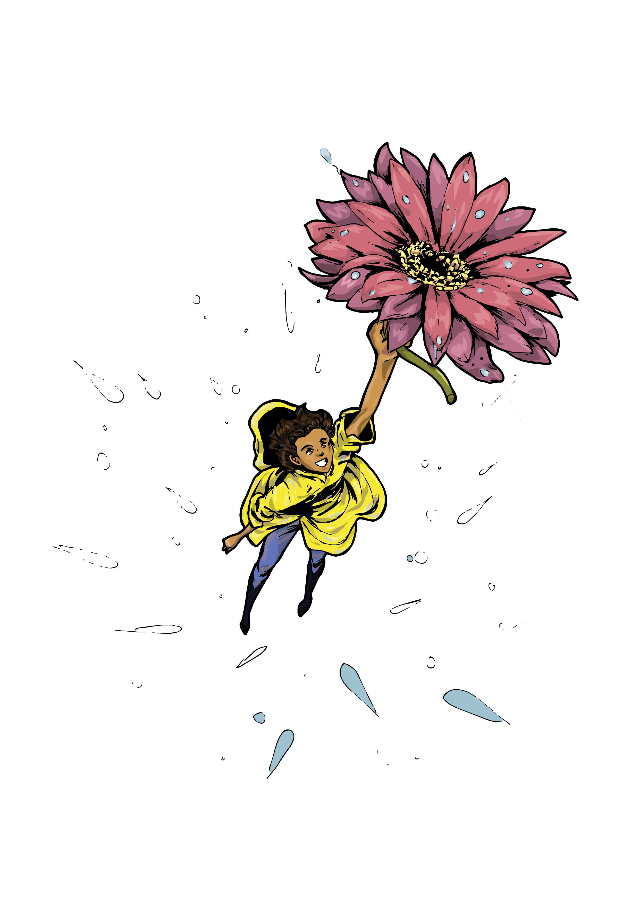
I’m getting used to making digital art nowadays, and this next project proves it. In my past art projects, especially the last Ryukyu Star cover and my personal avatar picture, I had trouble with the coloring. There was a thin layer of white surrounding all the lines I filled in even when I made the pictures into vectors in Illustrator. I finally looked up how to color hand-drawn images from a free class on Skillshare.

skillshare

I highly recommend joining this website. It has classes on art, writing, and marketing–all things artists, writers, and self-promoting bloggers need in this digital world.

The hardest part about this project? The actual concept. I hate re-using other motifs, and if I have to, I’d rather just not do it or tackle it in a different way. I pulled out the most famous part of Alice in Wonderland–falling down the rabbit hole–and replaced Alice with a man working on something because this is the busiest time for English teachers.

Image (69)

I ended up changing the original concept and added a fall-to-winter doorway.
rsFallcover2014_1 After changing the original design, I started to paint the image in Photoshop. I learned that if I put the image’s layer in Multiply mode (it’s usually set in Normal mode), all whites in the picture would become transparent. This solved my white line problem and made my life a lot easier.

rsFallcover2014_2

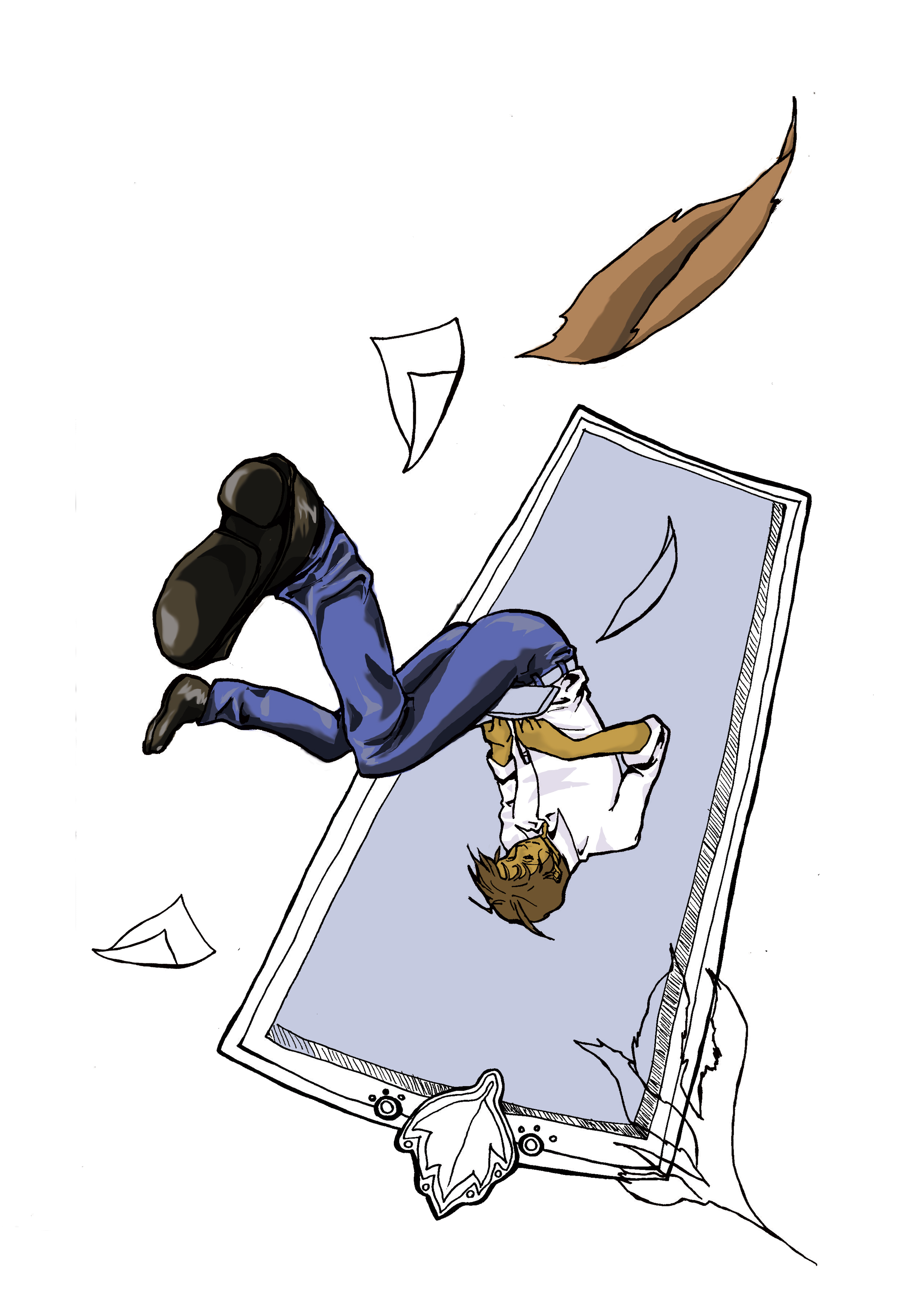
I did almost lose the colored picture. I was happy to play with lots of colors and gradients to get the final image below.

rsFallcover2014_3

#4 of 33 Art Projects: Ryukyu Star Spring Issue Cover

For the Ryukyu Star, a publication created by and for JET Programme participants in Okinawa, Japan, I made a cover using this issue’s theme, the rainy season.

1. The penciling and inking: It took me longer to come up with the concept actually drawing it! I had to look at different pictures and paintings with rain and spring. Finally, I decided using an Arriety-style character with a larger-than-life flower instead of a typical umbrella. The inking was done within 20 minutes.

rsspring20142. Tracing and Base Colors: After I scanned the image into Illustrator, I did an image trace (Illustrator traces the image and makes it into a vector) and painted in the base colors.

rscover_spring2014b3. Photoshop: I took the image to Photoshop in two different layers. One layer was the transparent black-and-white image on top of the base-colored image. The rest of the coloring were sandwiched as layers between the top black-and-white image and the colored one so that I wouldn’t end up coloring over the lines.

rscover_spring2014c

4. Coloring: If I were drawing or painting this image, I’d start with the lighter colors and work into the darker colors. I took the opposite approach and started with the dark colors and build up to the light colors.
rscover_spring2014d5. Final version: With the coloring done, I transferred this image to InDesign (since I always get the sizing wrong when I do it independently). I added a blue background, the magazine title, and lines.

RS_Winter2014_coverI’m still getting the hang of digital coloring, but it’s good to see that my art schooling be used more constructively.


#2 of 33 Art Projects in a Year

#2: The Ryukyu Star Winter 2014 Cover

I’m the visual editor for an online magazine for Japanese Exchange and Teaching Programme (JET Programme) teachers in Okinawa. I’ve decided to completely change the design of the magazine to make it more efficient as a magazine. To commemorate this change, I took the skills I learned on Photoshop and used it to color this mediocre inking of a horse.

Image

This horse was drawn without any preliminary sketches. I wanted to keep it fun and a little messy by just going at it with a Copic multiliner pen.

Image

Next was tracing it in Illustrator and ignoring the whites.Image

I transferred the image to Photoshop and used many layers underneath the vector to color it.

Image

Since I was using InDesign for designing the layout of the magazine, I decided to put the final product in InDesign. I always get the cover sizes wrong, so it’s just easier and cleaner.

New Year, New Skills, New Profile Pic

My husband showed me a tutorial on coloring images, and I decided to try it out since I’m trying to transition from traditional media to digital media.

ImageI sketched out a random picture of myself on a crummy piece of notebook paper (see edges). Then I used a sepia-colored School-G Tachikawa pen to outline it.

profile2 Cleaned up the pencil marks with a plastic eraser.

profile3Went over the outline with the same pen and darkened some areas.

profile4Put the file into Adobe Illustrator, traced it, and colored it with base colors.

profile6Took the image to Adobe Photoshop, made a transparent layer, used the “Lasso” to pick the highlights, and brushed and smudged the colors for the face.

profile7Finished my first Photoshop mini-project (and my new profile pic)!

Screentones for Manga Artists Outside of Japan

screentones_header

Screentones for Manga Artists Outside of Japan

“Where do you get screen tones if you’re outside of Japan?” 

If you want to make manga the traditional way by cutting screentones and applying them directly to your drawings, you can find some online, but they’ll be a bit pricey. It’s better to go to a Japanese district if you’re near one and find a bookstore. Otherwise, you can go online and order them.

If you’re more of a digital artist, you can use a computer program to make the screentones. The most common programs are Clip Studio Paint ($49.99) and Photoshop ($699). (If you go to an anime convention, you might see a booth selling Manga Studio with discounted versions available. If you don’t have this program and you’re on a time crunch, just download the trial versions.) You can also download  free screentone packs from other artists like the Screentone Society on Deviant ArtAshura’s Screentone Depot, OrneryJen’s screentone page, Psychobob’s screentones (password: psychobob), Shounen Ai Go’s screentones (old), or Jason Tucker’s “Screentones” page. The only bad side to using purely digital screentones in manga is that sometimes the tone looks too digital, too clean. Some ways to get around that is to scan a few physical screentones and use them when the manga looks off after toning.

Here’s a video on how to do digital screentoning on Photoshop (new and old versions of Photoshop are applicable):

If you want the best of both worlds–the traditional way of making manga with the digital ease–you can print screentones on transparent paper and apply them to the physical manga. You can also scan the physical screentone to your computer, define a block of it as a pattern in Photoshop, and use it (Edit>Fill>Pattern) after selecting the area you want toned.

If you’re skilled with a pen, you can also use carefully planned hatchbacking and pointillism, but it won’t look so professional (just more artsy).

Hope this helps with your manga dreams!

Also, please read former Prince of Tennis manga assistant Jamie Lynn Lano’s (http://www.jamieism.com) posts and theshazerin’s (http://theshazerin.deviantart.com/) post about manga supplies.

Need more inspiration? Check out these manga with Renta! that use many different screentones, but really pay attention to the softer tones!

Rentascreentones

Check out Renta! manga for screentone inspiration!

Bonus

If you don’t know how to apply traditional screentones to your manga, here’s a tutorial from Manga University.


If you’re looking for pens to ink your manga that will suit your budget, please read this post (Manga Pens for Manga Artists Outside Japan) comparing Japanese manga pens and their prices from online shops.