#10 of 33 Art Projects: Ryukyu Star Winter Issue Cover

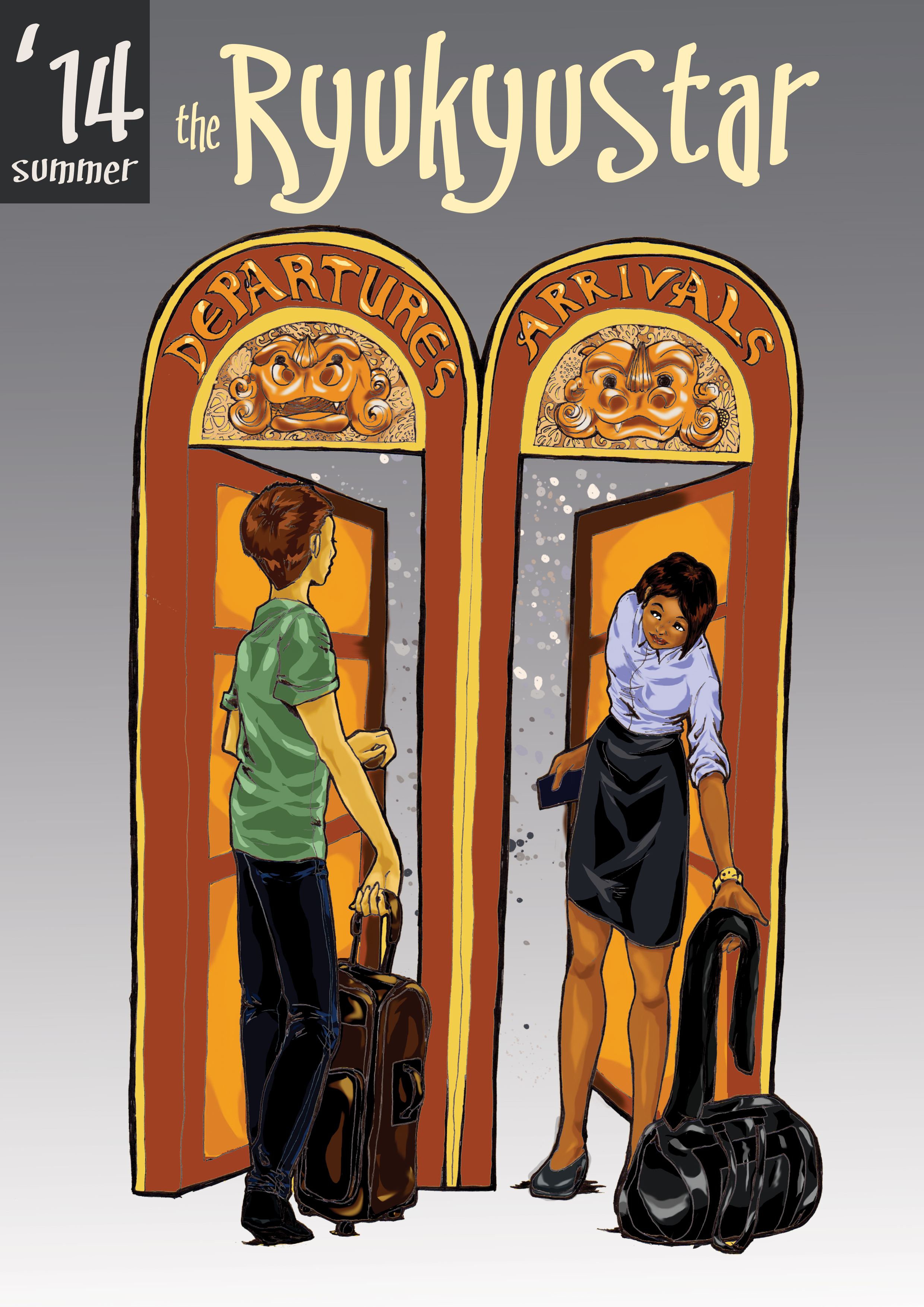
I had fun doing this cover for the Ryukyu Star. I used the knowledge I gained from the last cover and quickly finished this one. The hardest part about this project was deciding the colors. It’s a good thing I let the colors speak for themselves.RS-winter-cover2015bw

I penciled, inked, and scanned the base image.RS-winter-cover2015_1

I made several layers in Photoshop and colored the image. I usually start with a base color–in this case, warm colors–and work my way from the body to the rest of the image.

RS-winter-cover2015_2

After I apply a base color, I put in dark layers, light layers, darker layers, and finally, the lightest highlights if needed.

RS-winter-cover2015


The final image has warm colors (autumn) and cool colors (winter) to show how one season goes into another.

#7 of 33 Art Projects: Summer Cover of the Ryukyu Star

“How do digital artists take drawings from pencil to fully-colored images?” I’m always wondering this. In every digital art project, I’m looking for a breakthrough, and even if I flip through magazines and tutorials on the subject, the best way to learn is to practice.

This was the first image I colored without converting the inks to vectors. I deleted the negative space, going in as far as pixel by pixel, and darkened the inks with some level adjustments.

rs-cover-bw

I created a separate layer and colored it as the base color.Maybe it’s just habit from painting, but putting down a bright base color makes the other colors brighter, especially if the colors are placed using around 80 percent opacity. In this project, I used a bright orange-yellow that would lend itself to dark and light colors.

rs-summer-cover-baseI made different layers for each color, usually starting with the medium color followed by the dark colors and highlights.

rs-cover-color2


rs-cover-color3


rs-cover-color4

rs-cover-colorfinish

rs-summe2014r-cover

What do you do to digitally color images? I really like to get constructive feedback and how I can improve my art!

#2 of 33 Art Projects in a Year

#2: The Ryukyu Star Winter 2014 Cover

I’m the visual editor for an online magazine for Japanese Exchange and Teaching Programme (JET Programme) teachers in Okinawa. I’ve decided to completely change the design of the magazine to make it more efficient as a magazine. To commemorate this change, I took the skills I learned on Photoshop and used it to color this mediocre inking of a horse.

Image

This horse was drawn without any preliminary sketches. I wanted to keep it fun and a little messy by just going at it with a Copic multiliner pen.

Image

Next was tracing it in Illustrator and ignoring the whites.Image

I transferred the image to Photoshop and used many layers underneath the vector to color it.

Image

Since I was using InDesign for designing the layout of the magazine, I decided to put the final product in InDesign. I always get the cover sizes wrong, so it’s just easier and cleaner.