
Rest in power, Chadwick. You’ll always be our Black Panther.
The dress that the woman is wearing is a real dress from officially licensed DC brand, Hero Within. Get it at https://herowithinstore.com/collections/marvel/products/black-panther-dress.

My way of increasing artistic time
Rest in power, Chadwick. You’ll always be our Black Panther.
The dress that the woman is wearing is a real dress from officially licensed DC brand, Hero Within. Get it at https://herowithinstore.com/collections/marvel/products/black-panther-dress.

#1 of 33 Art Projects
In 2014, I started the 33 Art Projects series to practice my artistic skill. Here’s the 2016 revamp with one of my firsts, a hand-drawn and colored banner:
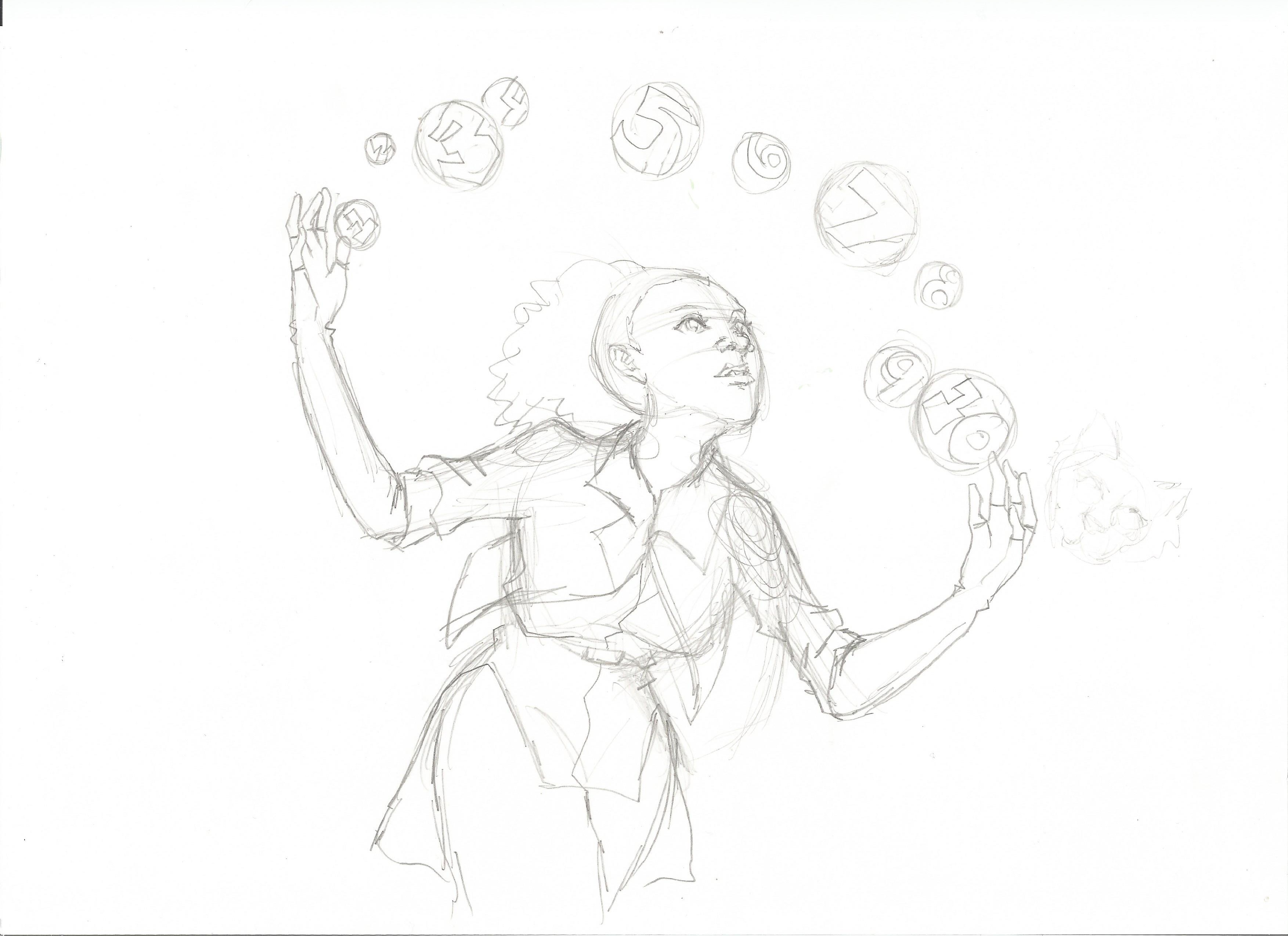
Created a pencil sketch.
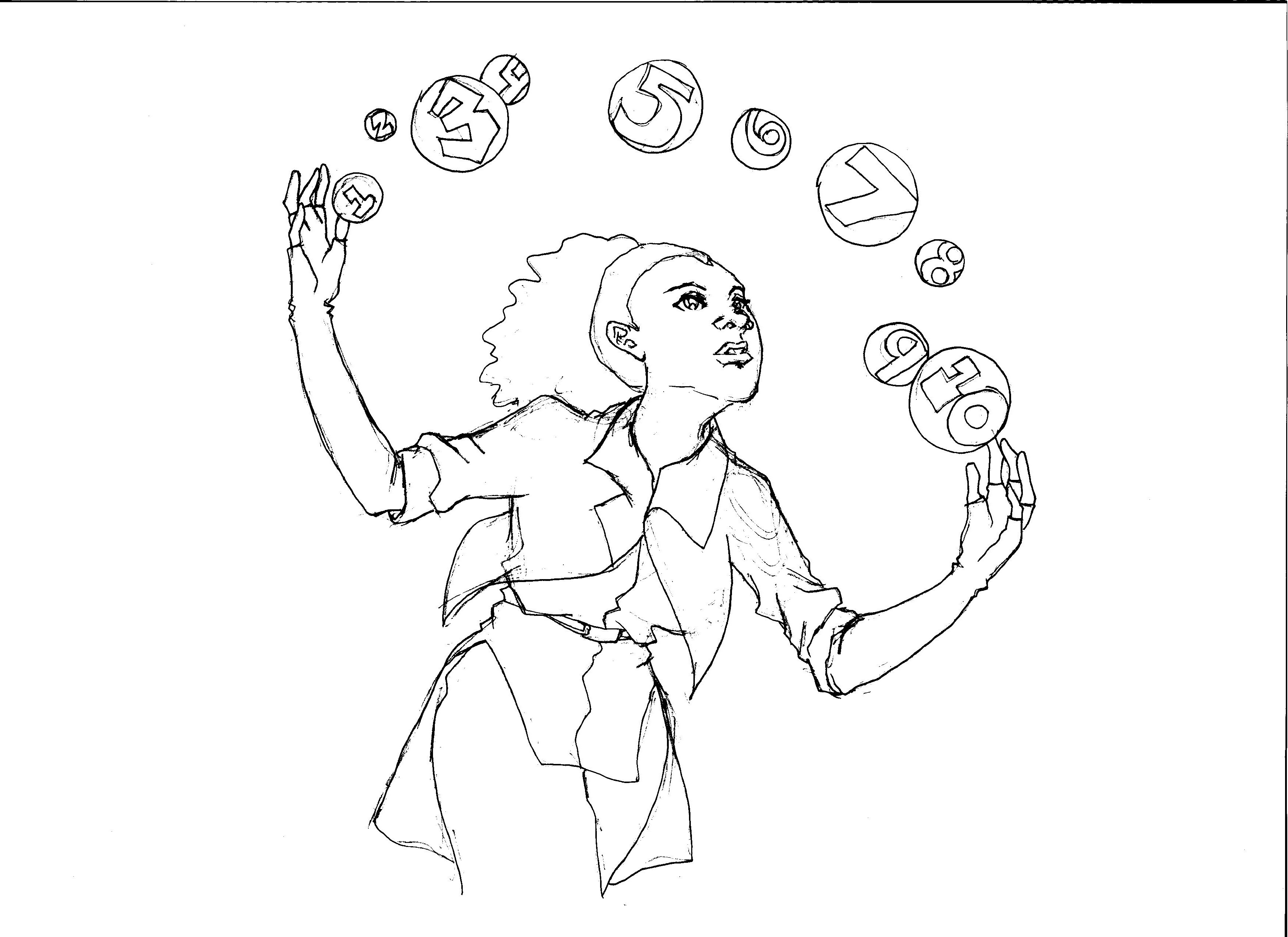
Cleaned up the sketch.
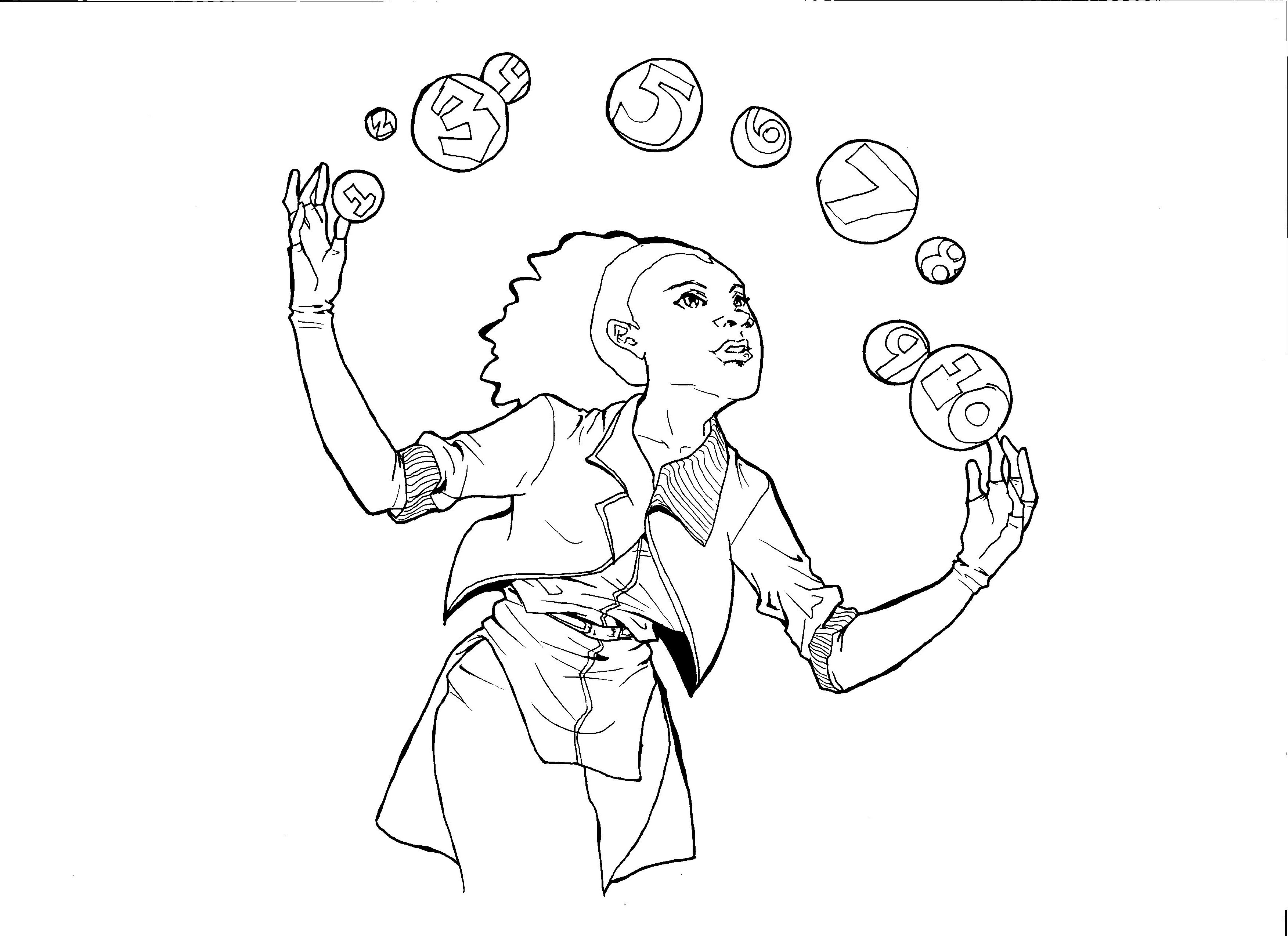
Inked the sketch and added in shadows.
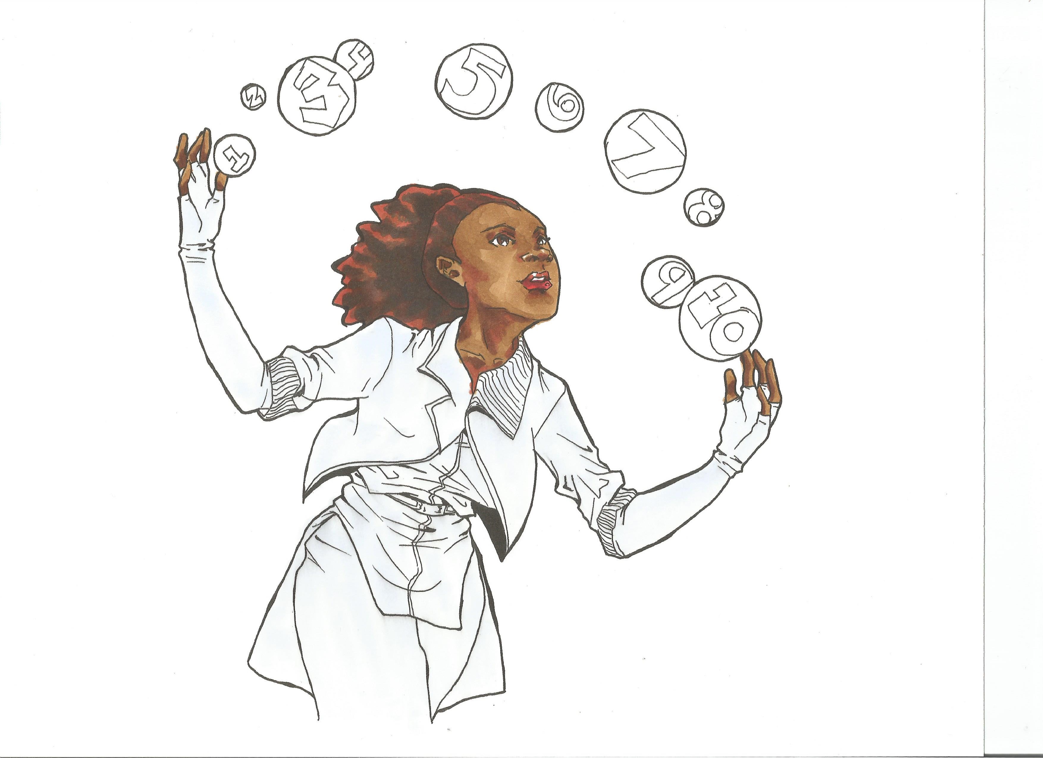
Did preliminary coloring with Copic markers.
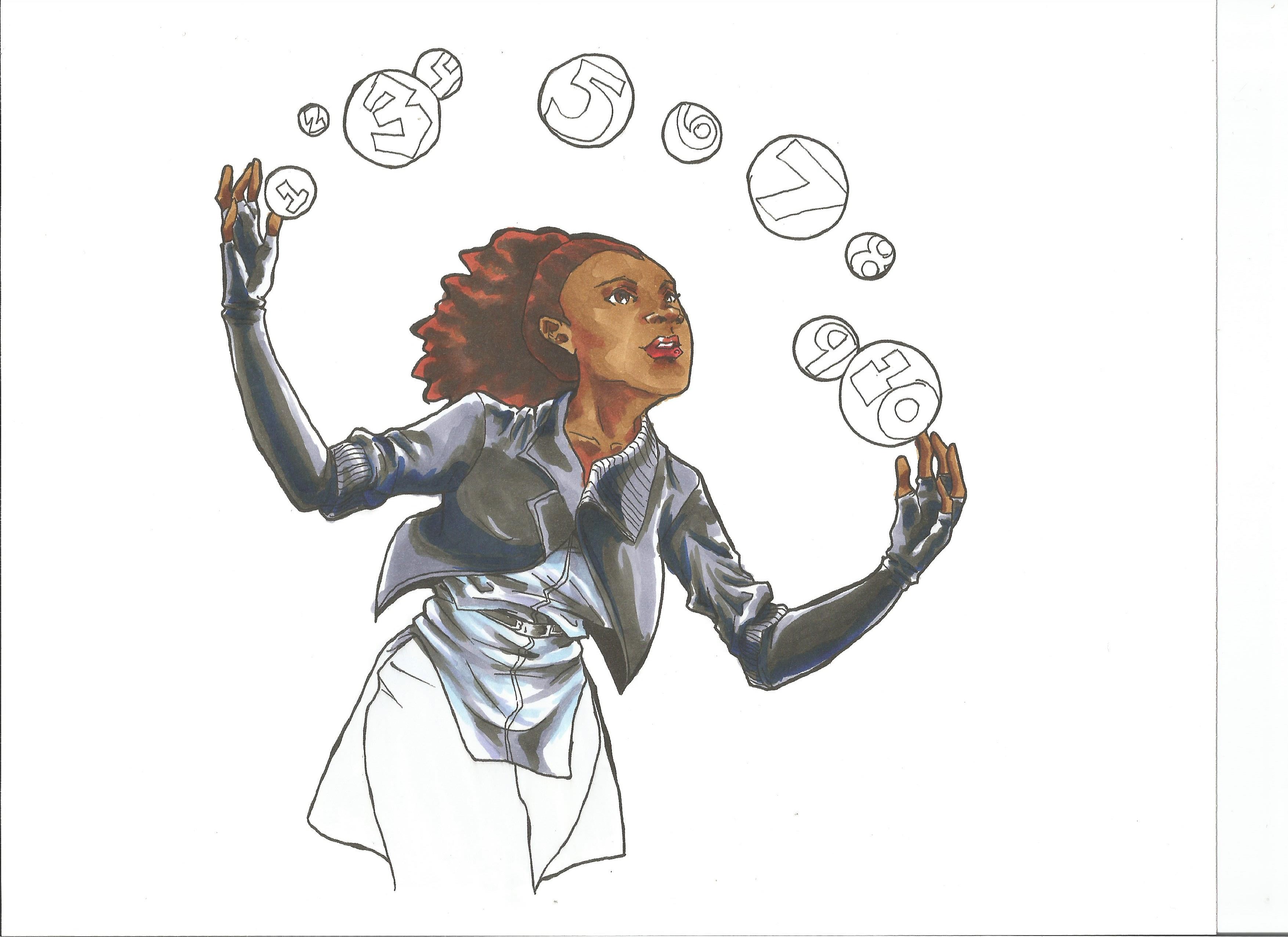
Continued coloring with jacket, shirt, and gloves.
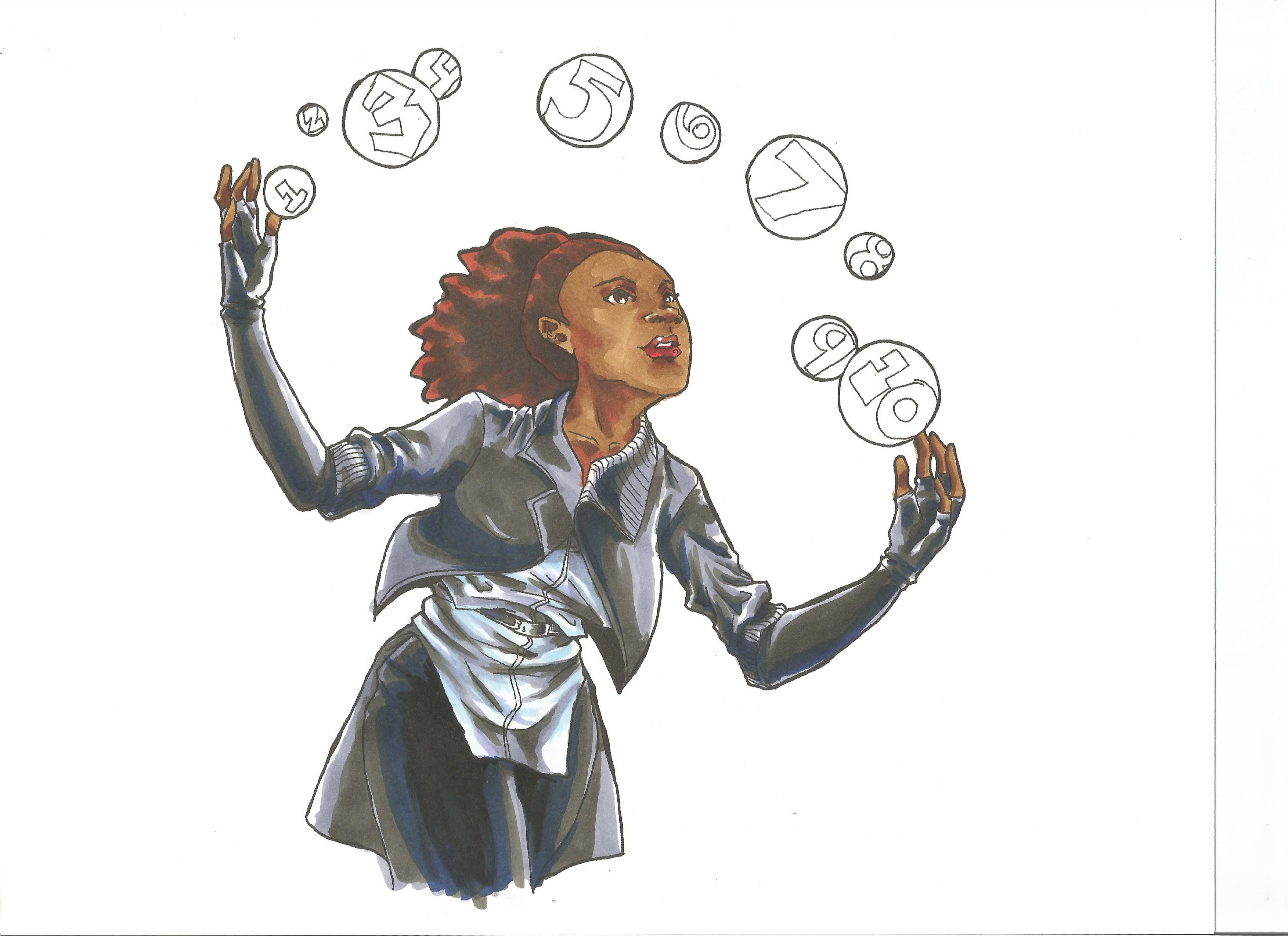
Finished coloring the pants.
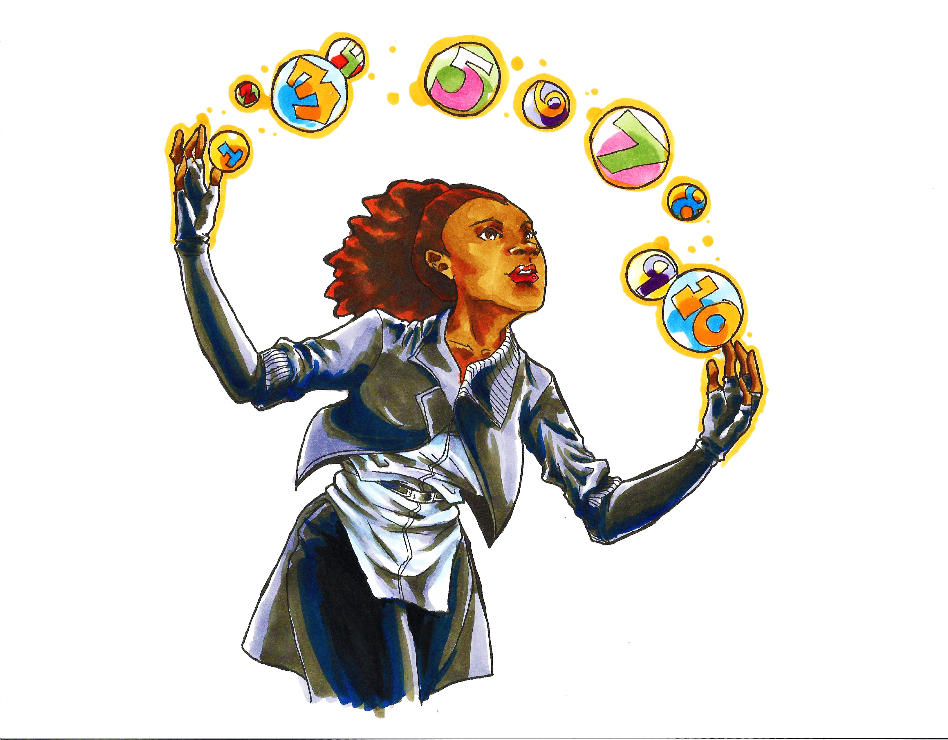
Complete coloring with a saturation and brilliance adjustment in Photoshop.
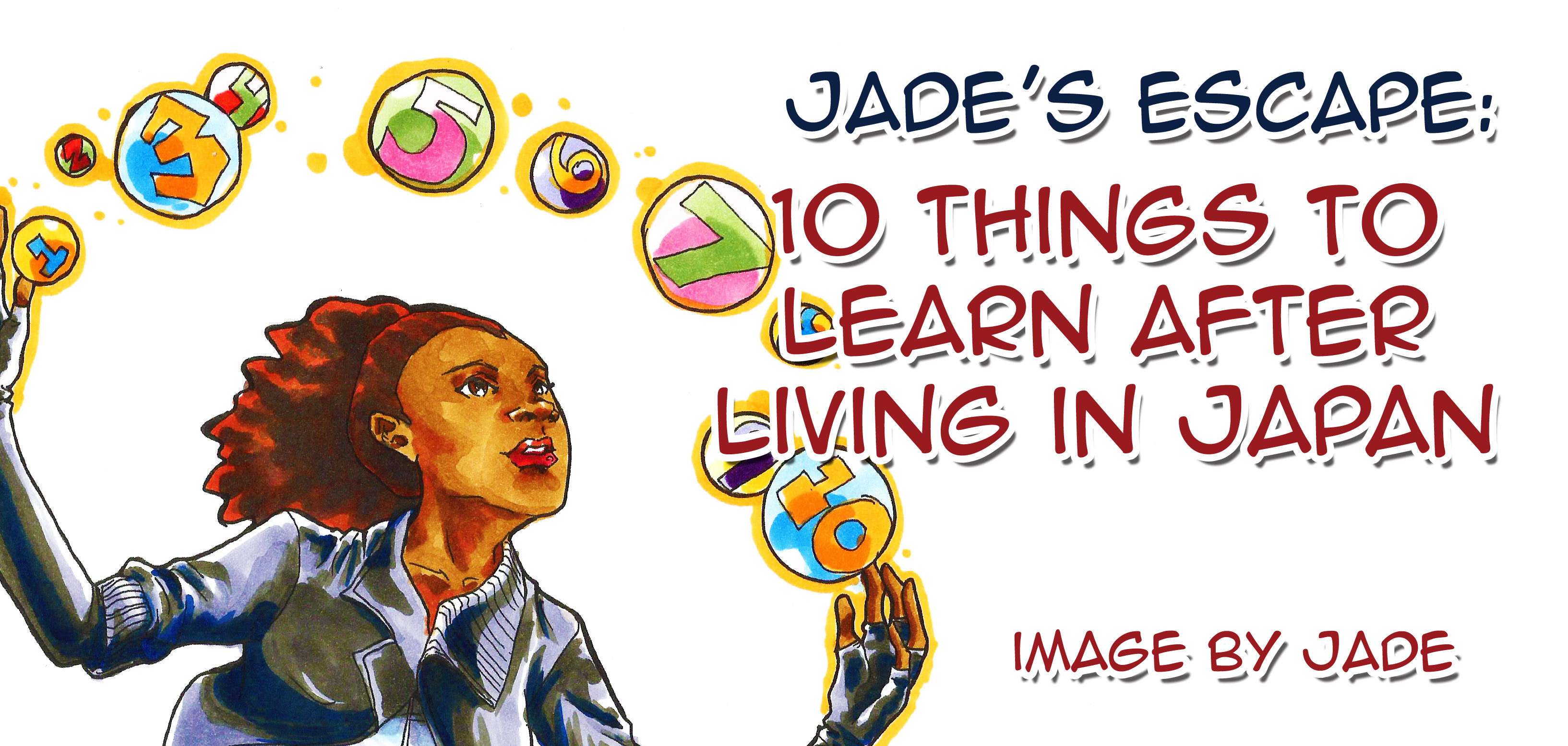
My final product: a banner for Jade’s Escape.


2015 Resolutions from a Japan Fan
Last year, I made some typical resolutions–losing weight, saving money, reading 50 books, and completing 33 art projects–and I met some of them. I lost 15 pounds after July’s knee injury (no exercise, too) and read 55 books in 2014. I unfortunately didn’t finish 33 art projects nor save money, so I felt a little disappointed in myself. Still, I’ve battled the horse through injuries, failures, and burn-outs, and I’ve found one thing to be tried and true: I’m going to do accomplish many goals before I leave Japan this year.
Read more manga. I really want to read old manga. I feel like old manga had more meaning. If you look at my reading list for last year, I started reading older or re-released manga including Barefoot Gen, 47 Rounin, Doraemon, Sazae-san, Children of the Sea, Gundam Wing, and Evangelion. The reason why I’m looking at older manga and classics is because the newer stuff isn’t cutting it. I also read Assassination Classroom, Crimson Empire, Devils and Realist, Sankarea, Ultimo, and Zero’s Familiar Chevalier. This latter group just rubs me the wrong way. Every plot device in manga is glaringly obvious, so much so, I just dropped them off my reading lists–or ranted about them on the Anime3000 and Manga Corner podcasts. If you have any good recommendations for me with atypical plots and characters, please contact me right away.
Do more art projects. So I didn’t do 33 art projects last year, but I’m set on doing it this year. I’ve set a goal for myself on Anime3000’s Manga Corner: to do a motion comic per podcast. I can do it. I just need to buckle down…and get a Mac. ( ̄◇ ̄;)
Wean myself off the internet. Yes, yes, it’s a weird resolution, but I sit in front of a computer maybe 8 to 10 hours a day. That’s too many hours sitting down.
Post more manga artist stuff. If you’re an aspiring manga or comic book artist, I’ve got the section for you. Last year, I posted “Online Communities for Aspiring Manga Creators“, “Manga Pens for Manga Artists Outside of Japan“, “Deals and Savings for Manga Artists“, and “Manga, Comic Book, and Graphic Novel Courses for Aspiring Creators“. Got something you’re always looking for as a manga artist? Let me know in the comments section, and I’ll compile a list of resources for you and other artists.
I hope I can accomplish this stuff in a year. I’ll be leaving Japan, my second home, in July or August after 5 years, and I’ll have to adjust to American culture again. \(^▽^@)ノ

I had fun doing this cover for the Ryukyu Star. I used the knowledge I gained from the last cover and quickly finished this one. The hardest part about this project was deciding the colors. It’s a good thing I let the colors speak for themselves.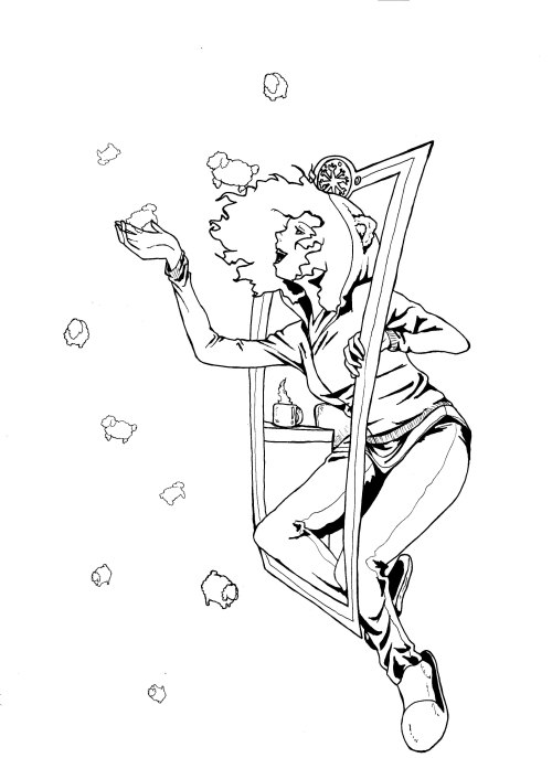
I penciled, inked, and scanned the base image.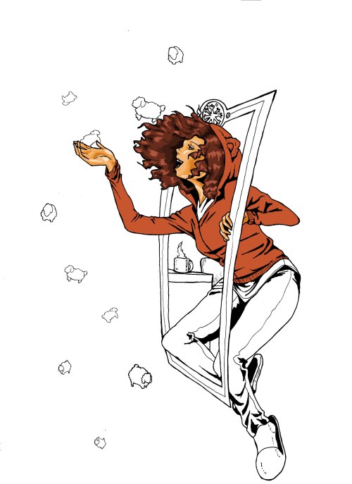
I made several layers in Photoshop and colored the image. I usually start with a base color–in this case, warm colors–and work my way from the body to the rest of the image.
After I apply a base color, I put in dark layers, light layers, darker layers, and finally, the lightest highlights if needed.

The final image has warm colors (autumn) and cool colors (winter) to show how one season goes into another.

I’m getting used to making digital art nowadays, and this next project proves it. In my past art projects, especially the last Ryukyu Star cover and my personal avatar picture, I had trouble with the coloring. There was a thin layer of white surrounding all the lines I filled in even when I made the pictures into vectors in Illustrator. I finally looked up how to color hand-drawn images from a free class on Skillshare.
![]()
I highly recommend joining this website. It has classes on art, writing, and marketing–all things artists, writers, and self-promoting bloggers need in this digital world.
The hardest part about this project? The actual concept. I hate re-using other motifs, and if I have to, I’d rather just not do it or tackle it in a different way. I pulled out the most famous part of Alice in Wonderland–falling down the rabbit hole–and replaced Alice with a man working on something because this is the busiest time for English teachers.

I ended up changing the original concept and added a fall-to-winter doorway.
 After changing the original design, I started to paint the image in Photoshop. I learned that if I put the image’s layer in Multiply mode (it’s usually set in Normal mode), all whites in the picture would become transparent. This solved my white line problem and made my life a lot easier.
I did almost lose the colored picture. I was happy to play with lots of colors and gradients to get the final image below.


Every summer, the art teacher in my school does bingata lessons. I did this last year and the year before.

First, a water-soluble resin is put through a stencil with wire and dried. Afterwards, you can paint directly on the dried parts. The painting process is similar to making woodblock prints (ukiyoe). You first apply the base layer, which is usually a light color. In all of my paintings, I use really light colors that contain yellow (unless I plan on painting blue or purple over them). It’s really important to know what the final picture will look like so that you can plan the base accordingly. If not, it’s easy to drawn out the base color with indecisive colors. After the base colors are applied, you dry the dye with a hair dryer and go on to the next part of the painting.
The second part of the painting process is putting the final shades and tones. I use a small soft brush and a regular brush (one in each hand) and blend the colors. Because I started out with bigger brushes, the phoenix in this image came out funny. It’s my own lesson to choose my brushes carefully from now on. Once all the colors have been applied, you dry the dye until the resin flattens. Place your finished painting into water for a few hours, or if you want the resin to come off more easily, put it in water for a couple of days. Finally, you wash the resin off without rubbing the fabric together, and let the fabric dry.
This one wasn’t my favorite bingata because I only had an hour to make it where I previously took two or three hours to make.
What do you think about it?

“How do digital artists take drawings from pencil to fully-colored images?” I’m always wondering this. In every digital art project, I’m looking for a breakthrough, and even if I flip through magazines and tutorials on the subject, the best way to learn is to practice.
This was the first image I colored without converting the inks to vectors. I deleted the negative space, going in as far as pixel by pixel, and darkened the inks with some level adjustments.

I created a separate layer and colored it as the base color.Maybe it’s just habit from painting, but putting down a bright base color makes the other colors brighter, especially if the colors are placed using around 80 percent opacity. In this project, I used a bright orange-yellow that would lend itself to dark and light colors.
 I made different layers for each color, usually starting with the medium color followed by the dark colors and highlights.


What do you do to digitally color images? I really like to get constructive feedback and how I can improve my art!

I write different stories for contests, and every day, I get stuck. Sometimes, I can’t imagine a character’s clothing or a certain scene. I draw to brainstorm ideas until I get a clear image in my head.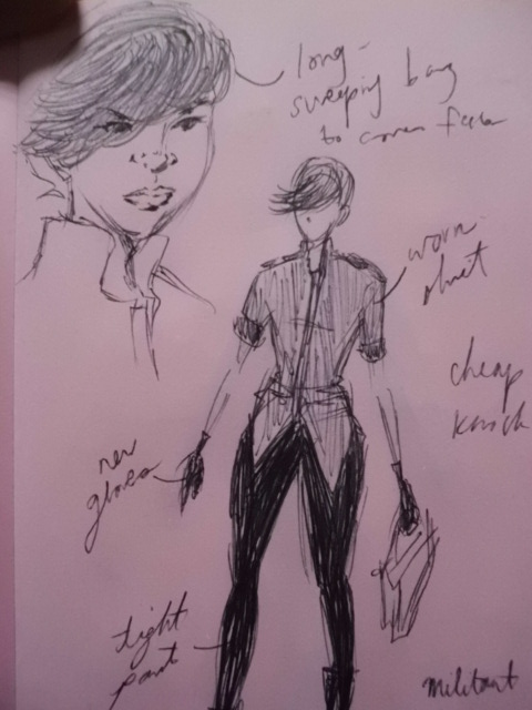
Costume ideas for a story.
Scene for a science fiction story.

First scene from a story…and, no, it’s not a manga.
Studying glass of water for a T-shirt design.

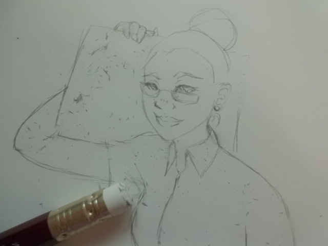
As William Zinsser says, “[…] look for your material everywhere, not just by reading the obvious sources and interviewing the obvious people” (On Writing Well, p. 58). I usually draw people I see because they provide material for stories. The picture above are two people I saw at the bookstore. Oh, and I do write in Japanese sometimes. Saves space.

My personal website needed some cleaning up, so I made a new entrance way.
1. Sketched the images.
3. Scanned and made into a black and white vector in Illustrator.
4. Used Live Paint in Illustrator, changed the stroke to dark brown, and colored the images.
5. Dropped the images into Muse, put colored blocks behind each one, and published the webpage to JeridelBanks.com.

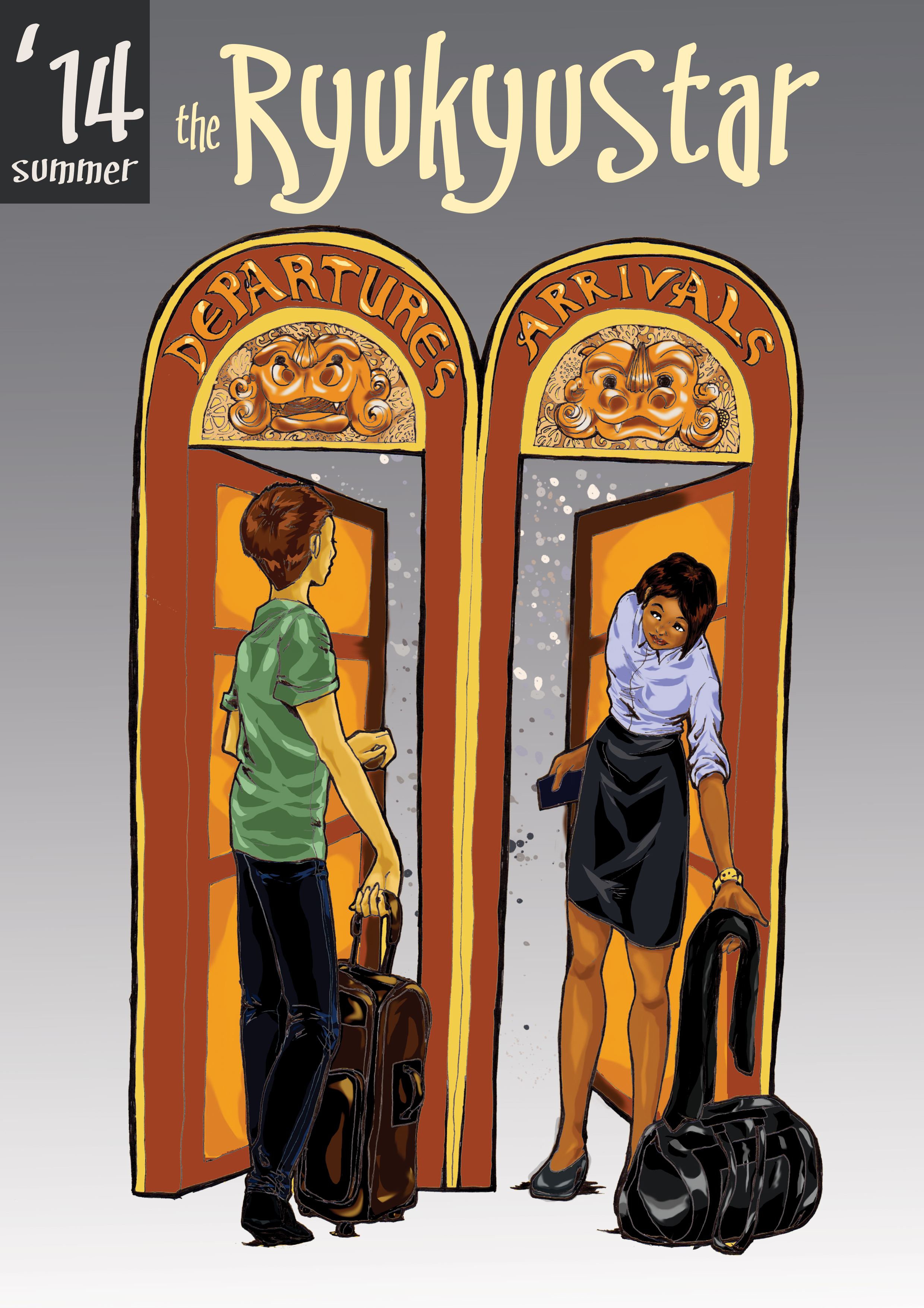
For the Ryukyu Star, a publication created by and for JET Programme participants in Okinawa, Japan, I made a cover using this issue’s theme, the rainy season.
1. The penciling and inking: It took me longer to come up with the concept actually drawing it! I had to look at different pictures and paintings with rain and spring. Finally, I decided using an Arriety-style character with a larger-than-life flower instead of a typical umbrella. The inking was done within 20 minutes.
 2. Tracing and Base Colors: After I scanned the image into Illustrator, I did an image trace (Illustrator traces the image and makes it into a vector) and painted in the base colors.
 3. Photoshop: I took the image to Photoshop in two different layers. One layer was the transparent black-and-white image on top of the base-colored image. The rest of the coloring were sandwiched as layers between the top black-and-white image and the colored one so that I wouldn’t end up coloring over the lines.
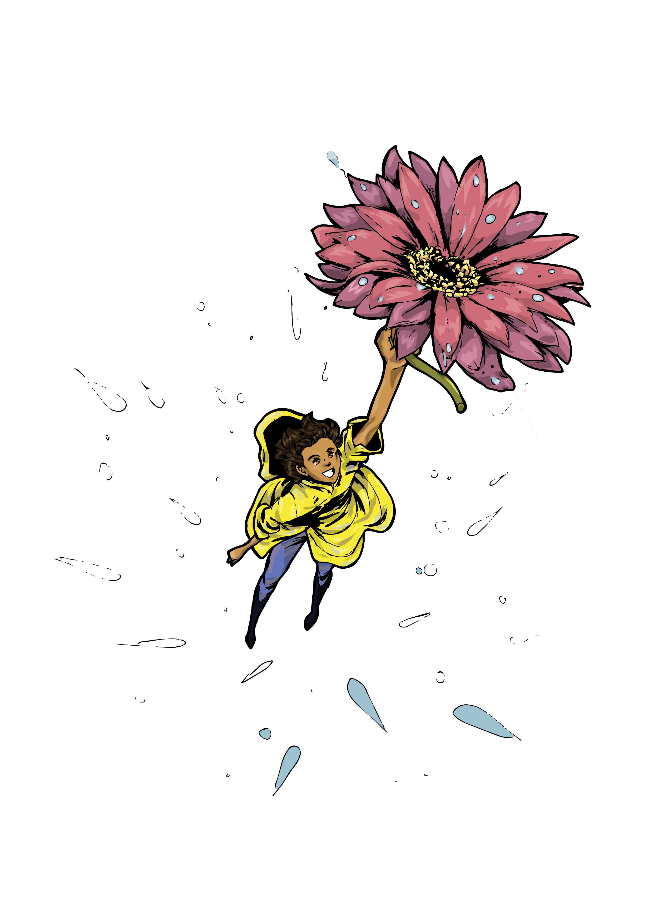
4. Coloring: If I were drawing or painting this image, I’d start with the lighter colors and work into the darker colors. I took the opposite approach and started with the dark colors and build up to the light colors.
 5. Final version: With the coloring done, I transferred this image to InDesign (since I always get the sizing wrong when I do it independently). I added a blue background, the magazine title, and lines.
 I’m still getting the hang of digital coloring, but it’s good to see that my art schooling be used more constructively.

I’m not good at making sequential art or manga strips. I did a short manga strip when Anime3000 first got big, and that’s where I learned that I needed more time with polishing my craft. Though I’ve tried to make manga over the past 4 years in Japan (not professionally, just experimentally), I haven’t improved. So, I decided to try an online manga course from Manga University. I’d been thinking about taking the course since I first saw the Manga University, but I didn’t have the money or time to take it.

I did it for you guys, too. I wanted to find an online manga course that works for aspiring artists. I guess you can say that this is my review of the Manga University home study manga course. Is it good? Is it worth the $39.99 (download) or $49.99 (snail mail)?
I honestly don’t think so.
The course asks students to draw one character and email it. This is the course’s best selling point: students’ pictures are redrawn by a professional manga artist with translated comments. I’m interested to see how my picture can be improved by a pro. Here’s my picture (sketch then ink):

But what about drawing manga? Well, the course, which is just weekly PDFs, shows how creators design each page, but students don’t send in their own manga. If students did this, then the $39.99 to $49.99 would be a decent price. A manga course should teach students how to draw comics, not how to draw characters. I understand that comics can’t be drawn without characters, but this course offers the most basic information, stuff you can find in a high school art class. For beginners who’ve never taken a such an art class or they don’t have access to in-person tutoring, this course might be suitable. Alternatives to this course are secondhand art books, Youtube tutorials, and other limited classes.
UPDATE (5/3/2014): I received an email that said they would give me a full refund since I’m advanced and the course is designed for beginners. I guess I’m not getting that revision from a pro manga artist…

#2: The Ryukyu Star Winter 2014 Cover
I’m the visual editor for an online magazine for Japanese Exchange and Teaching Programme (JET Programme) teachers in Okinawa. I’ve decided to completely change the design of the magazine to make it more efficient as a magazine. To commemorate this change, I took the skills I learned on Photoshop and used it to color this mediocre inking of a horse.

This horse was drawn without any preliminary sketches. I wanted to keep it fun and a little messy by just going at it with a Copic multiliner pen.
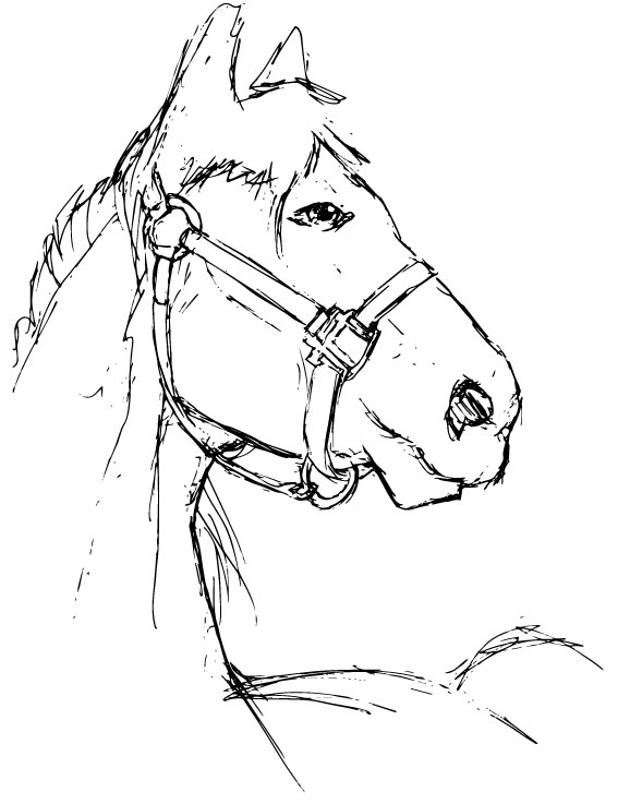
Next was tracing it in Illustrator and ignoring the whites.
I transferred the image to Photoshop and used many layers underneath the vector to color it.

Since I was using InDesign for designing the layout of the magazine, I decided to put the final product in InDesign. I always get the cover sizes wrong, so it’s just easier and cleaner.

#1: T-shirt Design Submissions for my friend’s book release
I created two submissions based on two poems from my friend’s book, Vogue 3:16
.
This design is from the poem “Denture Love”.

I really love this poem because it’s filled with warmth. As a married woman, I look at this poem as a standard for growing old with my husband (if time allows). I used a red shirt instead of a muted tone because the glass uses a blue almost monotone palette. Also, the poem has a calm flow but lasting love is very much passionate, at least, in my opinion.
Here’s the process of creating the design.

First I penciled and inked a simple sketch.

After I scanned it into the computer, I traced and colored it in Illustrator and copied the vector to Photoshop.

This was my third time using Photoshop to color an image. I only recently learned how to do this technique. The good thing is I am a traditionally-trained artist, and I borrowed some ideas from painting and color theory. The original base color of the entire image is a very light powder blue because I wanted everything to look submerged and glass-like. I used layers for each different color. It took me a long time to get the look to where it is now. I need more time to analyze glass. Anyways, it took me several days to color this in.
This design is from the poem “Johnny Appleseed”.

This design took more time to do because I don’t like drawing technical things (machines, cars, straight lines). I wanted the pain in the man’s face to be the first thing everyone sees. Though the poem itself depicts a man who has given up on many things and has accepted his sad environment, I think that the man hasn’t truly given up. He is just trying to find somewhere that isn’t where he’s at, but he’s being forced back into the stereotypes and lifestyle that society won’t let him leave. I might be wrong about the interpretation of this poem. Even so, I’m just happy making a design close to my heart: being a black person trying to get away from the “machine”, the stereotypical identity that “higher ups” have coerced everyone to believe in.
Here’s the process.


I used Copic Multiliner Pens to outline this image. It took a long time…
I scanned it and traced it in Illustrator.  I colored it using layers for each item (machines and skin). I didn’t want the things from the poem (mic, ball pencil, headphones) to disappear into the folds, so I used burnt orange over grey to make them stand out a little bit.
If you like poetry or the concepts of these designs, please buy my friend’s poetry collection, Vogue 3:16!


